Invisible Man Book Jackets July 19, 2010
Posted by leskanturek in Books, Summer Reading Project, The Invisible Man.Tags: Invisible Man book jackets, Parson's Illustration Dept. Summer reading
add a comment
Below is a sampling of the Invisible Man book jackets.

 Fourth row down from the top , the left book cover (red linen, with line drawing) is the cover of the first edition (1897).
Pop-Up Assignment Gallery May 26, 2010
Posted by leskanturek in 3-D work, Books, Class Assignments, Handmade, Movable Illustration, Pop-Up, Student work, Uncategorized.Tags: Movable Illustration, Pop-Up workshop, Student work
add a comment
Coinciding with Teen Liu‘s visit (link to the post of Teens’s visit ) and pop-up workshop was a class assignment to create a pop-up. Students choose their own theme/concept to work from and
space
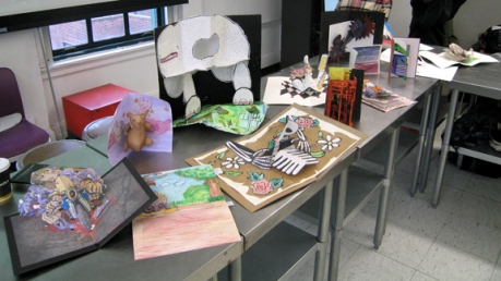
they could incorporate any paper engineering technique they learned at the work shop or that they could devise. The only criteria was that the pop-up actually fold flat and it must be able to open multiple times. Below are the finishes :
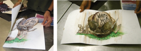
 (above) Pratima Mani- “What’s in Wolf’s Belly?” Prat’s pop-up is of particular note because her wolf rotates around upon the page opening.
space
 (above) John Garcia-King and Queen of Hearts
space
 (above) Deborah Mouloudji- Snails and leaf, 2 sliders
space
 (above left ) Brianne Bowers rotating Ferris Wheel (right) Cityscape by Josey Herrington
space
 (above) Biker by Lyejm Kallas-Lewis
space
 (above Left) Psycho by Leila Ehtesham (Right) River by Rachel Tonthat
space
 (above) Christine Westrich’s pop-up Chef
space
 (Above left) a Beast by Grace Lang (right) stuffed animal pop-up by Grace Moon
space
 (above left) Jun Hui Im’s mask (right) Skeleton by Ciara Gay
space
 (above) a larger gold fish pop-up spread accompanied by a beautifully done smaller book all my Masuko Jo
Visual Thinking and Literature May 9, 2010
Posted by leskanturek in Books, Narrative, Student Post.Tags: Book Arts, Creative text on books, Rachel Tonthat, Salvador Plascencia
add a comment
Post by Rachel Tonthat
space
One of the most fascinating things for me is the intersection between art and literature. This can most commonly be found in the realm of comics, but I have been interested in artists and writers who move between genres or redefine them.
My best friend had the recent opportunity of interviewing Salvador Plascencia who I believe is an example of an unconventional thinker.
Salvador Plascencia is the author of the novel The People of Paper, a book that amazes me in terms of the relationship between the story and the actual physicality of its vessel (one of my other obsessions being the symbiotic relationship between stories and bookmaking). The story is set in El Monte, a small town which finds itself in a struggle against an invisible enemy they call Saturn, which is later revealed to be the author himself. Their war on Saturn is a war in which they try to reclaim their town for their own, learning to hide their thought and thus erasing them from the pages of the book. In first edition of the novel, words are physical cut from the pages of the book as the people rebel.
space
What I find so remarkable about his system of writing is that it is a very visual process. Each chapter is encoded using circles and dashes, and his manuscript is laid out in a sketchbook with the different shapes and sections. Though he is not an artist, the way he writes is visual.
In one of his quotes he states,
“I do think that the way we materially see the novel has a profound effect on the way we construct narrative. If we understand the novel as a single column of prose spread over five hundred pages—so one block of text per page—the stories and paragraphs we write are in a very real sense just conforming to this arbitrary guide. From a production and design perspective, it makes sense to streamline—eliminate multiple columns, push out the woodcuts, standardize the fonts and sizes. You can move the novel from site to site much easier this way: a near automated process from hardback to pocket paperback to e-book.
Somewhere along the evolutionary line of the novel, we opted for faster flips of the page over a more varied typography. We opted for velocity… I’m interested in the reverse: in a writing that sticks to the page and brings the reader closer to the pulp that they are holding. Novels where the paper is the site of the novel, not just some container.”
Not only is Plascencia’s visual process interesting, the way that he is looking to reuse the design of a book to interact with the reader seems like a crucial point for us as illustrators and designers. This concept could be easily applied to fine art, comics and even advertisements with incredible possibilities. Often I believe it is easy to become complacent with the tools we are working with, when, as Teen showed us, paper can almost speak its own.
Salvadore Plascencia’s interview in the Nashville Review is definitely worth reading. I would rather not take the photos of the original manuscript from the site, as I feel that might be an infringement of something.
http://www.vanderbilt.edu/english/nashvillereview/archives/1084
Teen Liu-Pop-Up Workshop April 4, 2010
Posted by leskanturek in 3-D work, Books, Guest Visits, Handmade, Movable Illustration, Pop-Up.Tags: Class visit, Paper Engineering, Pop-up book, Pop-Up workshop, Teen Liu
2 comments
March 22nd paper engineer, illustrator, and designer Teen Liu came into class to discuss her work, pop-up books and to conduct a paper engineering/pop-up workshop. Teen has worked with pop-up artist Robert Sabuda and Matthew Reinhart, The Museum of Modern Art, editorial pieces, and fine art life size gallery installations (24 foot high pop-ups!).
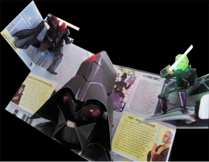
You might also have seen some of her designs and paper engineering she has worked on including Star Wars: A pop-up guide to the Galaxy (check out the LED light sabres and a very cool Darth Vader), The Tomie de Paola’s pop- book Streganona, the Chronicles of Narnia pop-up book, or the cards and ornaments she has designed for MoMA.
Teen got down to business fast, and before you knew it scissors and paper was flying.
 (above left) Teen demonstrating a fold (right) Josey and Grace cutting away
After going over some basic folds and cuts ie: a V fold mouth, and a layer pop-up we quickly got into something a bit more complicated a turtle with movable legs. Teen had given out a link to pop-up instructionals on Robert Sabuda‘s site which has a section called Simple Pop-Ups You Can Make! which has step-by step tutorials, though of course it’s not the same as having an engineer in the room trouble shooting why your turtle is dying a slow pop-up death.
 (above) left Ciara , right Teen working with John on his turtle.
space
After the workshop Teen spoke about various pop-up project and the process of taking a pop-up from concept to appearing in print. Planing and mocking up versions during the concepting stage it can take 6-7 or more dry runs before the construction is perfected. Then after the pop-up is test printed out , constructed again to make sure it fits.
 (above) printed die-cuts for Fairies ready to be cut out and assembled. (image from Teen’s site)
It was a great workshop and visit. Many thanks to Teen for sharing her expertise and time. When you take a look at her site make sure to check out the pop-up done for Shit Disco’s music video among the other cool things . Thanks Teen!
Pop-Up Books March 1, 2010
Posted by leskanturek in 3-D work, Books, Movable Illustration, Pop-Up.Tags: Movable Illustration, Paper Engineering, Parson's Illustration Display, Pop-Up books
1 comment so far
 A toy, miniature theatre, automata, animation…all this resting between the covers of a book on your shelf. Pop-up books were, for most of us, our first experience treating a book as a precious object, something to stare at in amazement and share with others as illustrations break the rules of 2-D print by coming alive. Open the spread of a book and it’s the reader that makes the doors on the bus open and shut, or causes Alice’s house of cards to fall around her. Illustration in movable 3-D, viewers can look at the same scene from multiple viewpoints and interact with it.
 (above) A spread from The Wonderful Wizard of OZ: A commemorative pop-up by L. Frank Baum and art by Robert Sabuda. Tucked in a pocket on the page are green sunglasses to view the emerald city (and everything else) with.
space
Books with moving parts have been around since at least since the 13th century when volvelles or rotating paper circles were used in books to illustrate philosophical ideas. Later they were used to demonstrate astronomy, mathematics and other scientific theory. It would take another 200 years for moveable books to be marketed to children.
 (above) A volvelle from Astronomicum Caesareum c. 1540 showing the orbital period off the moon.( from the Lib. of Congress)
Space
Lothar Meggendorfer, (http://www2.lib.virginia.edu/exhibits/popup/meggen.html) a 19th century German artist, created superb moveable illustrated books. Illustrations in Meggendorfer’s books performed as many as 5 or more actions simultaneously in different directions.
 (above) Lothar Meggendorfer’s International circus (photographed by G. H. Mott)
Blue Ribbon Publishing in New York in the ’30s was the first publisher to use the term “pop-up” to describe their movable illustrations. Books like “Puss in Boots” from 1934, engineered by Harold Lentz, vied for the attention of an audience that was getting used to the relatively new medium of animated cartoons.
Today, hundreds of pop-up books are produced around the world each year. Each book has to be painstakingly assembled by hand.
space
Contemporary paper engineers like, Robert Sabuda, (http://www.robertsabuda.com/) and Mathew Reinhart are designing more and more complicated pop-ups involving sound, and light. Pop-up books have since crossed back from being exclusively for children and now marketed in some cases exclusively to adults and museums.
In this post–modern technological age the artistry, craft and surprise of illustrations printed on paper that pop-up to life still fascinate.
space
Pop up display key
- Cow and Her Friends: A Golden pop-up book
- Mommy? Story by Arthur Yorink, illustrations by Maurice Sendak, paper engineer Matthew Reinhart
- The 12 days of Christmas : A Pop-up Celebration by Robert Sabuda
- ABC3D – An alphabet book by Marion Bataille. Each of the 26 three-dimensional letters move and change.
- The Wonderful Wizard of OZ: A commemorative pop-up by L. Frank Baum and art by Robert Sabuda
- XXX pop-up book
- Little Monsters by Jan Pienkowski Publisher: Candlewick; Pop Rei edition (July 8, 2008)
- The Pop-up book of Phobia’s created and written by Gary Greenberg, Illustrated by Balvis Rubess, Pop-ups by Mathew Reinhart
- Hallo our Motorcar: Schreibers Plastical Picture-books
- TK pop-up book
- Leonardo Da Vinci: The Artist Inventor, Scientist in three-dimensional, movable pictures by A.& M. Provensen
- Uz Jsme Doma pop-up book and dvd,-Uz Jsme Doma (oosh-smeh-doe-ma, Czech for “we’re home!”) is a band from the Czech republic.The pop-up book is a collaboration between UJD lead Miroslav Wanek and the painter Martin Velisek
- Alices’ Adventure’s in Wonderland : A pop-up adaptation of Lewis Carroll’s Original Tale by Robert Sabuda
- Silly Heads by Ruth Wickings & Cathie Shuttleworth Publ. DK
- Winter’s Tale: An original pop-up Journey by Robert Sabuda
- The Pop-up Buck Rogers- 1930’s
- Little Red Riding Hood illustrated by Patricia Turner: A peepshow book
- Say Cheese – David Pelham
- Carter, David A. 600 Black Spots: A Pop-up Book for Children of All Ages New York : Little Simon, 2007
- Fungus the Bogeyman Plop-up book by Raymond Brigs
Thanks to faculty member Peter Hamlin for creating the video demonstrating the books in the showcase. Here are links to the video posted on youtube
www.youtube.com/watch?v=rawuw02klbYe spacespacespacwww.youtube.com/watch?v=0iQlOr71Hmw
www.youtube.com/watch?v=vaVK1qpgq90 spacespacespacwww.youtube.com/watch?v=xvh9b74fpqc
Other Links:
the Movable Book Society
http://www.movablebooksociety.org/
Teen Lui/Paper Engineer
Pop-Ups and Movable Books: a Tour through their History
Su Blackwell-the Other Life of Books February 11, 2010
Posted by leskanturek in 3-D work, Books, Handmade, Student Blog posts.Tags: Altered books, Brianne Bowers, Cut Paper, Paper Sculpture, Su Blackwell
1 comment so far
Post by Brianne Bowers:
(Above) Pandora Opens Box 2009 (all photos and work from http://www.sublackwell.co.uk/ and © Su Blackwell)
Space
If you’ve walked past the windows in Kate’s Paperie on 13th Street a few months ago  you will have noticed works by artist Su Blackwell. I discovered this London based artist a few years ago when researching paper cut artists. Her altered book/pop-up style book sculptures have garnered a lot of notice, leading to magazine and other commissions, such as The Times Magazine, Waitrose, Food Illustrated, Vogue, Cartier Store (Paris) and Beringer Wine.
 (above) Chatsworth Derbyshire’ A Guide
space
Su attended Royal College or Art in London and majored in Textiles. What makes her work appealing is how delicate and precise her cuts are all while keeping them within the pages of an old book. These cut-outs can take up to a month to complete.
 (above) Alice – A Mad Tea Party
space (above) Alice Through the Looking Glass
 (above) The Wizard of Oz photographed by Irene CooperS
pspaace
As seen above, Blackwell has cut Illustrations for stories such as Alice in Wonderland and the Wizard of Oz. Su has also made her creations come to life in various stop motion commercials which you can view on her website. http://www.sublackwell.co.uk/
Space
-Brianne Bowers
Film & Graphic Novels, Twin Sons of Different Mothers December 8, 2009
Posted by leskanturek in Books, Comics, Film, Story Boards, Visual Narrative.Tags: FIlm books, Graphic narrative and film, Graphic Novel book suggestions, storyboards, Visual narrative books, Will Eisner
add a comment
Since the advent of photography there has been a cross fertilization between the camera and the canvas. Early silent filmmakers were inspired by Gustave Dorés book illustrations (L’inferno 1911 by Francesco Bertolini). Film pioneer George Melies was influenced by illustrator Henri de Montaut’s work for Jules Verne’s From the Earth to the Moon, inspiration has see-sawed back and forth many times. Film noir influenced pulp images and early comics. Presently we’re seeing the trend of graphic novels being adapted to film. it makes perfect sense, The mediums are closely related and share a common visual vocabulary. Animation has long bridged (and blurred) the line between film and drawing.
Any one interested in visual story telling; Comic books, graphic novels, story boards should include in their education a critical eye on film and a reading of books that describe the visual narrative tools of film. How to compose shots, visual sequence and how it affects a narrative, point of view, this is all the common vocabulary of telling a story visually whether it be in print or film.
Below are a few film books that I think bear looking at for your narrative education. Especially for those of you interested in storyboards. It then becomes extremely important to understand and speak in the language of film photography.
Setting Up Your Shots: Great Camera Moves Every Filmmaker Should Know By Jeremy Vineyard
This is a basic book that describes different shots in film with an accompanying illustration and a suggestion of a film that employs an example of the shot. It’s written by a non-professional which has strengths and weaknesses.
I like the book because it is so basic and written for someone who knows nothing about film. It will get you thinking along film lines very quickly. I have read criticism of the book that the names of shots in some cases is inaccurate and some of the examples of where you can see the shot are general which can be frustrating.
(Above) Film Directing Shot by Shot: Visualizing from Concept to Screen: by Stephen Katz
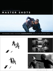
(Above) Master Shots: 100 Advanced Camera Techniques to Get an Expensive Look on Your Low-Budget Movie by Christopher Kenworthy. Master Shots has an example of the shot in a film and different views of the shot using poser figures.
 (Above) Storyboard Design Course: Principles, Practice, and Techniques by Giuseppe Cristiano
Space
The above is by no means all the books out there just a couple to start you thinking from the film side vs. the graphic novel/comic book side.
(Above) Comics and Sequential Art by Will Eisner is a fantastic book my a master story teller. One of the things that impresses me about this book is that Eisner addresses the concept of time in the narrative. How to depict a finite amount of time passing which i think is very much akin to film.
 In the above panel Eisner has linked 2 simultaneous actions, the dripping faucet in the extreme foreground and the character entering. The slow drip is the reference point for time. Looking at only 3 panels you can tell it has taken the character a long time to enter. That’s an understanding of visual narrative. There is a wonderful Hamlet soliloquy drawn by Eisner in the book as well as other gems that really show why he is considered a master storyteller. The book I’d say is an absolute to pick up.
Pinocchio Cover Gallery July 29, 2009
Posted by leskanturek in Books, Pinocchio, Puppets, Summer Reading Project.1 comment so far
A sampling of Pinocchio books:
 1. Lane Smith (2003) 2. Mauro Evangelista (2006) 3. Gus Grimly(2009) 4. Sara Fanelli (book with slipcase 2003) 5. J.J. Menet (France 1945) 6. Lois Lenski (1940)

7. Tony Sarg (1940) 8. Sergio Rizzato (1963) 9. Jim Dine (2006) 10. Art Seiden (1954) 11. Benito Jacovitti (Italy 2001) 12. Winshluss (2009)

13. Matthias Griebler (German 2007) 14. Lorenzo Mattotti (Italy 1991) 15. TK (Japan 1997)

16., 17. James Jean (2008)
 18. J. Pavlin – G. Seda, (Czech, English version 1974)
The Lexicon of Comicana September 3, 2008
Posted by leskanturek in Books, Comics, Uncategorized.Tags: Grawlixes, Lexicon, Mort Walker
add a comment
Did you know there are names for all those shorthand marks that cartoonists employ to show say motion in an object or person, or the misc. symbols that convey a character is cursing up a blue streak?
Cartoonist Mort Walker who draws Beetle Baily, and Hi and Lois among other strips, has also published a lexicon that attaches names to all the visual symbols that cartoonists employ to indicate motion or dizzyness, to name a few.
The misc. type characters that are used to denote a character spewing curses are called Grawlixes according to Mort. So, read the lexicon, impress your professors, and come off as the erudite art scholar you knew you always were.





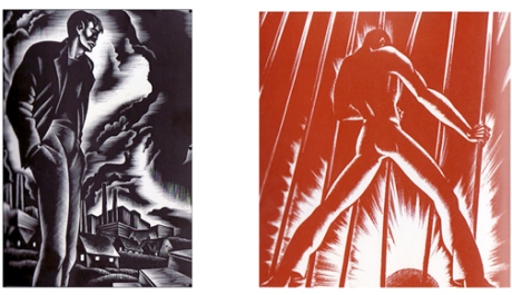
 graphic novel. Ward’s novel tells the story of a young man as he navigates through the racism, injustice, and poverty issues America faced during the 1930’s.

You must be logged in to post a comment.