Anime Transformation March 4, 2011
Posted by leskanturek in Animation, Art History, Comics, Film, Student Blog posts, Student Post, Visual Narrative.Tags: Anime, Death Note, Sailor Moon, Sarah Ding, Transformation
add a comment
Post by Sarah Ding
Space
Anime is a distinct art style that originated in Japan during the 20th century, in which Japanese filmmakers first became influenced by Western animation techniques. The highly successful Disney 1937 animated film “Snow White and the Seven Dwarfs” became a huge influence on manga artists, who simplified many of the techniques and styles of Walt Disney’s animations due to low budget and labor. Throughout time, the distinct look of anime has transformed significantly, and although there are numerous different styles of anime, they all have common stylistic elements typical to the anime style.
space
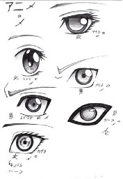
So what exactly is the anime style? Although the features of the face and proportions of anime characters are exaggerated, they are not necessarily classified as cartoons. The most distinct feature of anime characters is their overly large eyes, in order to express their emotions through to the viewer.
However, recently anime has started to become extraordinarily more realistic in terms of the facial features. Even body proportions are beginning to fit the standard human proportions we would normally recognize. The most familiar form of anime could arguably be Sailor Moon, created by manga artist Naoko Takeuchi.
 (above) Sailor Moon, A team of magical cute girls who are in reality magical warriors destined to save the Earth, and later the entire galaxy. Their features and proportions embody the look of anime girls.
space
Anime might on the surface appear to all look very similar but is in fact quite varied. The anime style of Sailor Moon is remarkably different than the style the viewer sees in Death Note, a well-known manga created by writer Tsugumi Ohba and illustrated by manga artist Takeshi Obata.
(above) Two of the characters in Deathnote , Light Yagami, and “L” .
space
The art and possibly even the story line has taken on a more realistic approach. Here, the manga artist is deviating from the usual large eyes and small mouth characteristics that are typical of anime and drawing features more in proportion.
(above) Death Note illustrated by Takeshi Obata
space
Although there will always be different variations of anime (from very generic to semi-realistic), I feel that this style in general is starting to become much more realistic by opening itself up to different influences and styles.
Motion in Art February 7, 2011
Posted by leskanturek in Art History, Student Blog posts, Student Post, Uncategorized.Tags: Leigh Cunningham, Motion in art, Nude descending a staircase
add a comment
Post by Leigh Cunningham
The concept of motion has been explored throughout history in the work of artists. Depicting motion in art spans the range of two and three-dimensional pieces, and covers a broad spectrum of cultures and purposes. While traditional art works (drawings, paintings, sculptures and photographs) served only to capture a single moment in time, numerous artists have challenged these restrictions and ventured to convey a sense of movement, or a suggestion of motion over a longer interval of time. One of the early artists to explore motion and a main sources for contemporary artists interested in motion is the work of Eadweard Muybridge (1830-1904). Branching off of genuine intrigue and exploratory research, Muybridge began photographing animals in motion, and by1878 he had done a series of photographs capturing a horse galloping, thus providing accurate reference for illustrators of the time.
(above) stills from Muybridge’s series, “The Horse in Motion”
space
Similarly, French artist Marcel Duchamp tackles the concept of motion through cubism, using fractured parts of what would seemingly be a sequence of images to show a figure in motion.
 (above left) Marcel Duchamp’s Nude Descending A Staircase 1912 (above right) Umberto Boccioni’s Unique Forms of Continuity 1913
space
Motion has also been handled in sculpture, perhaps the most prominent being the works created during the Italian Futurist movement. Italian futurism was about glorifying speed and in some cases, the brutality of war, while also declaring a new way of life during a time saturated in new technologies.
Umberto Boccioni’s futurist bronze sculpture incorporates the idea of motion into a deeper connection between the subject and it’s relation to the space around it. His sculpture serves as a tangible work of art that relates every being to its surroundings.
Contemporary painter, Gerhard Richter appropriated the idea behind Duchamp’s Nude Descending A Staircase and painted Woman Descending the Staircase, as well as Nude on a Staircase. In both paintings, the subject is painted in a naturalistic way, giving a completely opposite feel to the original iconic painting of Duchamp. While the viewer still does not see every step, a feeling of unrest exists in the piece, suggesting that she(the subject) is not a static element, but rather a component of the scene in its entirety.
(above left) Ema/Nude on a Staircase (Ema/Akt auf einer Treppe) (above right) Woman Descending the Staircase (Frau, die Treppe herabgehend) www.gerhard-richter.com/
Shunga May 13, 2010
Posted by leskanturek in Art History, Printmaking, Student Blog posts, Student Post.Tags: Japanese woodblock, Josey Herrington, Shunga
add a comment
by Josey Herrington
Shunga are erotic Japanese woodblock prints which can be traced back to the the Heian period (794 to 1185) but reached it’s peak in the Edo period (1603 to 1867). The intention of these prints is not to depict sex in a direct, explicit manner, but rather to express the energy, intensity, and beauty of erotism which exists in the Japanese culture but can not be openly demonstrated.
space

(above) An example of how Shunga seek to combine explicit sexuality and aesthetics)
These prints depict not just one idealized portrayal of erotism but explore varying and irregular forms of sexuality. The subjects depicted range from the Courtesans who attended the Shogun’s high court to the ordinary working class, from couples drastically differing in age to homosexuality and even zoophilia.
space

(above) Exploring sensuality between nature and animals
space
In the eyes of outsiders this could be seen as a form of primitive pornography, but on the contrary Shunga was not seen as a taboo and was widely accepted as a form of art. As western concepts of the erotic revolve around the amount of explicit nudity, the subjects in Shunga are clothed in flowing garments. This is because public baths or onsen were a part of everyday life in Japan and thus nudity was not valued as the erotic. The subjects clothing creates an aesthetically pleasing flow to their bodies but also directs the viewers eye to what is intentionally revealed.
Shunga is translated into “Images of Spring” and stands as a connection between the erotic and the beauty of the changing of seasons. It is an acceptable medium in which a culture embraces and connects within strict social boundaries.
space
 (above) Cherry Blossoms are iconic in Japan for representing spring
Nothing Is Simple April 10, 2010
Posted by leskanturek in Art History, Drawing, Student Post.Tags: New Yorker covers, Pratima Mani, Sempé
add a comment
Post by Pratima Mani
One of the most pleasantly surprising gifts I received from my sister over winter was a collection of cartoons by the 1930’s born French cartoonist Jean-Jaques Sempé. She had informed me that Sempé’s work was highly stylized, and very simple: pure black contour on white background. For someone who has always preferred more realistic/detailed/ rendered illustration (Peter de Seve, James Jean, Frank Miller), this wasn’t what I wanted to hear.
 (above) The cover of Sempé’s first published collection, “Rien N’est Simple” (Nothing is Simple) from http://www.pbase.com/csw62/image/38206202
space
Sempé is a cartoonist and so I (wrongly) expected work that was clever, and quippy…but not particularly touching. I was completely blown away by how endearing he managed to make his illustrations. Most of them feature visual repetition of some form. Sempé often repeats a single object/person and then adds an odd one out who is doing something totally different. At times he creates a series of very similar illustrations the slowly change and tell a story over time.
The result is that Sempé’s illustrations make you chuckle for their own pictorial quality; they do not overly rely on the text crutch to draw a response from readers. You laugh at the ‘black sheep’ of the image, or at how the characters expressions change from one frame to the next. The illustration speaks for itself, almost like those instances when you see some falling over in a ridiculous manner and it’s somehow funnier than the wittiest joke.
Sempé’s linework itself is one of those shining examples of the warmth of hand-drawn art. It is as clean as something pen-tooled but has a slight slant at times and a wavering line width. Seeing these traces of the hand-at-work, knowing that Sempé put in the effort to make all those repetitions for a single frame of illustration, is very special indeed.
 (above) left The cover of Sempé’s 1962 published collection, “Tout Se Complique” (Everything is Complicated) right The cover of Sempé’s translated published collection, “Everything is Complicated”
space
(above) Sempé’s illustration on the 5/3/1961 issue of “Punch“.
space
On a side note, and something I didn’t know until I looked up Sempé for this post- he has done many New Yorker covers! An example below:

(above) Sempé’s illustration on the cover of “The New Yorker” (5/20/85 ) from http://www.thejumpingfrog.com/si/1270952.html
Inkstuds: The Radio Show about Comics December 31, 2009
Posted by leskanturek in Art History, Artists, Comics, Graphic Novels, Visual Narrative, Visually Cool & Relevant.Tags: comic artist interviews, Inkstuds
add a comment
Despite the porn sounding name if you go to the Inkstuds site you will not find pictures of Jack Kirby giving you the full monty. What you will find is a radio show out of Vancouver hosted by Robin McConnell thoughtfully discussing the art, creators, the industry, inspiration, history and influence of comics.
 McConnell’s show which has been “on the air” for the past 4 years offers an incredible range of interviewees including ; Ralph Steadman, Seth, Tony Millionaire, Joe Sacco, James Jean, Barron Storey, Rutu Modan, Scott McCloud, Art Spiegleman on Chris Ware, Rick Geary…the list goes on. I highly recommend tuning in to the show and hearing the intelligent discussion that takes place.
MTA Arts in Transit Guest Visit April 29, 2009
Posted by leskanturek in Art History, Guest Visits, Public art.Tags: Amy Hausmann, Guest speaker, MTA Arts In Transit, Subway station proposal
add a comment
 (Above) Barbara Segal’s “Muhheakantuck (The River that Flows Two Ways), Aluminum reliefs on train overpass (2005) on the Hudson Line /Yonkers
On Monday (April 20th), Amy Hausmann (below-left), the Assistant Director of MTA Arts for Transit, paid a visit to our class to speak abo ut her department’s mission and role in commissioning artists for site specific, public artwork in the New York transit system.
Statistics on the amount of people using the transit system is staggering, approx. 8 million commuters on a given weekday. That’s per day. Asking for a show of hands of how many students (our class was joined by Wendy Popp’s concepts class.) view art work in the subway during their daily commute, it was an overwhelming majority. This was not always the case. My memory of subway stations while growing up in the 60’s and 70’s is one of decaying, vandalized public spaces. The way we presently experience the subway (and the LIRR and Metro-North) is a testament to the work MTA Arts for transit has done over the last 25 years to change the way we look at the shared public space of the transit system.
Amy started her powerpoint presentation pointing out that from the subway’s inception a mandate was built into it’s mission statement to create and design a visually beautiful public space, “…and enhance the experience of travel.” As Amy stressed , very forward thinking for 1904. MTA Arts for Transit’s budget for projects is derived from a portion of the renovation budget of the station/space to be refurbished. So art works are installed or planned only for a station that is being rehabilitated or improved.

(Above) Art en Route, A pocket guide to art in the MTA Network that was passed out during the visit. You can e-mail a request for a copy at the MTA Art for Transit site.
Amy brought with her pocket guides to some of the art in the MTA system. it’s organized by subway line with called out images of art installations. There is also a book, “Along the Way” by Sandra Bloodworth , Director of MTA Arts for Transit, and William Ayres, curator at the Long Island Museum in Stony Brook. Looking through the guide and book gives you a sense of the varied range of art in the transit system, both in concept and in materials. Donald Lipski’s inverted olive tree

with crystals at Grand Central Terminal, Walter Martin’s and Paloma Munoz’s Canal Street station filled with 174 grackles and blackbirds…the subway is one big art museum.
A number of illustrators have created art for the transit system; Raul Colon, Owen Smith, Milton Glaser, Dave Calver, George Bates (Parsons Illustration Dept. instructor), Peter Sis, Jose Ortega, Edward Del Rosario (Parsons Illustration Dept. instructor) to name a few. In that spirit, finishes for the class assignment of creating proposals for site specific art in individual subway stations were also up on the wall during Amy’s visit. she graciously agreed to critique them and offer her professional opinion .

You can view the entire assignment sheet I handed out in a previous post. In a nut shell, each student created artwork for a subway station of their choice. In the course of creating a proposal students researched the history of the area/station and took into account the 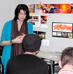 make up of the community it serves. Each student attempted to integrate their art with the architecture of the station in some way.
Below are some of the assignments.
P(Left) Amy Hausmann criting a student’s proposal
Place marker
Place marker
Place marker
Place marker
Place marker
Place marker
Place marker
Paula Searing: Wall Street
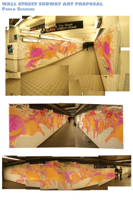
Rather than work with Bulls and Bears , I was struck with horses because they can be both graceful and rampant like Wall street’s sides of prosperity and cut throat behavior. The original art is done in acrylic paint, sprayed over stencils.
Place marker
Mark Lev: 50th Street

50th Street station ( the 1, 2, 3 line). My subway installation is interactive (a musical component) as well as aesthetic. It consists of several Hang drums (developed in 2000 in Berne Switzerland) of various sizes and tunings, installed into the subway wall. In the above mural they are the blue spheres with darker blue round indentations. The drums can be played without any special tools and create resonant, ghostly tones similar to a steel drum. The effect of several people playing them would be a mass of tones echoing throughout the station creating an eerie but sonorous atmosphere. Colorful, circular tile patterns around each drum seem to ripple across the wall, evoking ideas of sound waves, water droplets, and mimicking the sound qualities of the drums.

Here is a link to a video of the Hang drum being played http://www.youtube.com/watch?v=WEJc2wKkwjM&feature=PlayList&p=D12F8B5F76C1C4E8&index=32 it’s a very distinctive sound .
William Crosby: Smith-9th Street Subway Station Gowanus

The Smith/9th Street Station · Opened in 1933. The station has the distinction of being the highest elevated station in the system. The station was originally built elevated 91 feet to accommodate tall-mast shipping in the Gowanus Creek under the station.
Evan Turk: Greenpoint Ave. Station Brooklyn
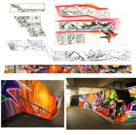

Evan’s mural is a narrative based on the Lenape Indian legend of Rainbow Crow. The Rainbow Crow brings fire from the Great Spirit in the sky to the earth. But due to the smoke he no longer is rainbow-colored , but a black crow. This myth was chosen to reference the Lenape Indians indigenous to the Greenpoint area.
Place Holder
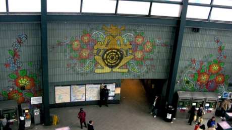
Julian Uribe: ” Cultural Intertwine” Jackson Heights (7, E, F, G, R, V)
Jackson Heights is one of the most culturally diverse neighborhoods and the first garden city in the five boroughs of New York City. I realized in every culture found in Jackson Heights the frog is a common symbol of nature, peace, and power. Ethnic patterns unite with the frog symbol in my design for the station, all of which I hope allow the neighborhood to be more in touch with their diverse ethnic community .
Place Holder
Julie Pinzur: ” The Bleecker Farm” Bleecker Street (the 6 train)

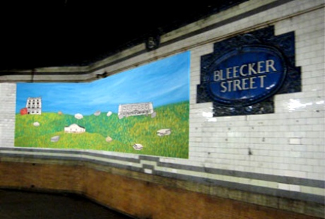
Ceramic mosaic on walls near the subway exit. Anthony Bleecker, who the street was named after, along with his family owned the land where the station now stands. The scene shows farmland, which is representative of this area in the 1800s. Anthony Bleecker was also one of the founders of the New York Historical Society, and was a trustee of the New York Society Library.
Place marker
Naomi Koffman: ” Ghost” 72nd Street/Central Park West


Place Holder
Jenel Lawson: Lexington Ave. 63rd St. Station
 Near this station four embassys are located; France, Italy, Pakastan and India. Different color strands of thread represent each country and stich part of the globe.


 (
(








You must be logged in to post a comment.